Peters Home: A Kitchen Color Story
“Brandi is so pro she makes you feel like the pro. She creates a relationship where she really listens so she understands what you want out of the project.”
—Kelsey Peters
When Kelsey and Jace Peters reached out to me, they were already mid-way through a gut renovation of the kitchen in the 1909 foursquare they had recently purchased.
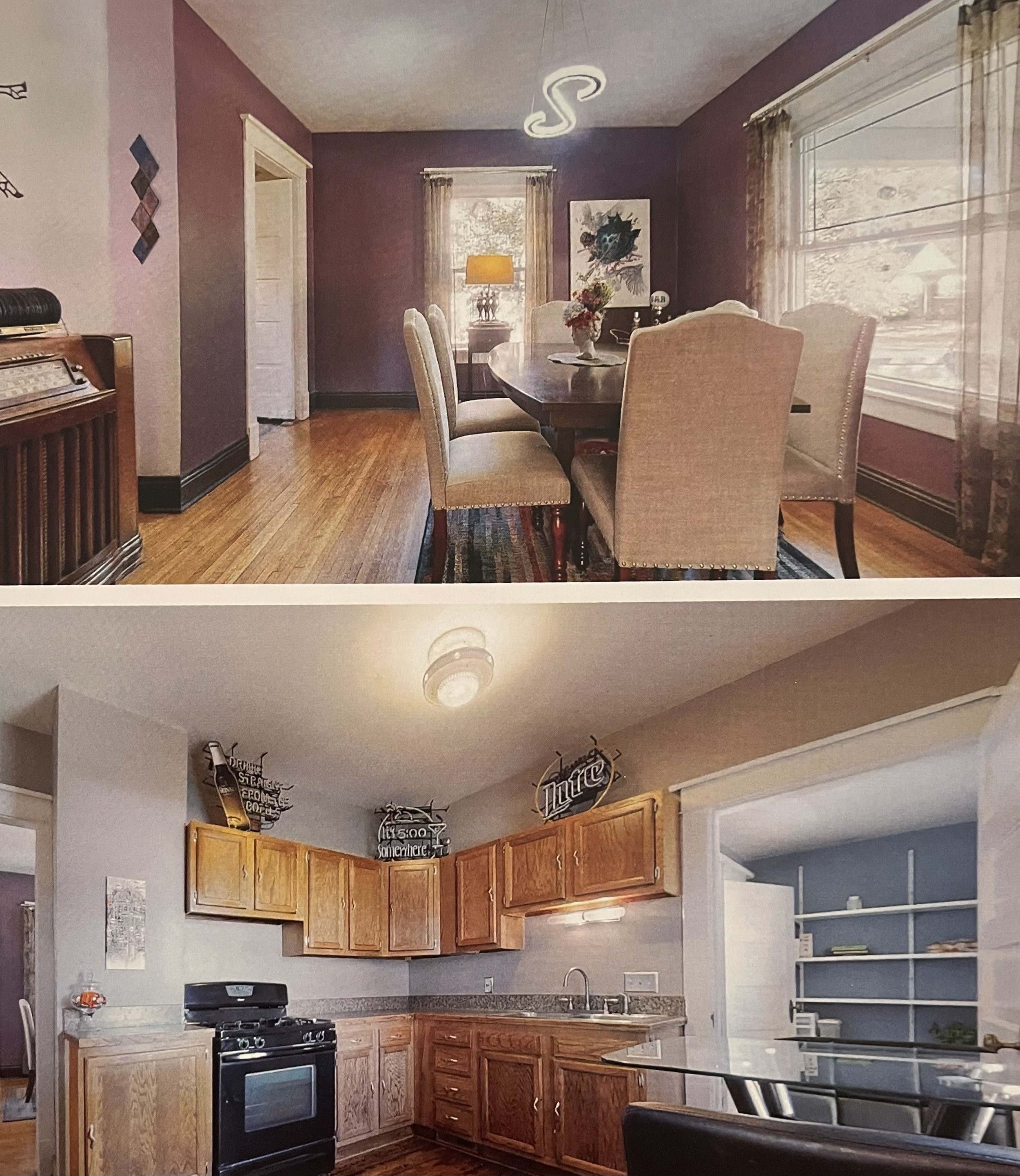
The existing kitchen was small and outdated (Violet-Gray walls, with dark granite countertops and 1980’s era oak cabinetry), separated from the compact dining room, and wasn’t functioning well for their lively family of four.
The Peters didn’t have the budget to hire a full-service interior designer on top of their general contractor (Skyler Camacho of WDO Custom, who also made all of their cabinetry), so they had taken on the roles of designer and project manager themselves—overseeing the GC, managing budgets and timelines, selecting materials, furnishings, and fixtures—all while working full time as a chiropractor and speech pathologist, and raising their two young girls.
Most people don’t have endless budgets to hire out these kinds of tasks to professionals. While taking them on is often a necessity, doing so can come with added stress, anxiety, and confusion. And rightly so—who has the time to casually learn the ins and outs of the design and build trades? This is where color consulting can be so helpful. And it’s why our services at A Lively Manner are structured to be accessible to a wide range of needs and budgets.
“Who has the time to casually learn the ins and outs of the design and build trades? This is where color consulting can be so helpful.”
Kelsey and Jace began by purchasing a 60-min Gut Check to get my opinion on some materials and finishes they were considering for the renovation. They already had a neutral color scheme in the rest of their house, punctuated by near-neutrals and few earth tones like sage, ochre, and rust. So when I came on board, Kelsey’s most pressing questions had to do with coordinating the new kitchen with their existing spaces—especially the adjacent living room, and a first-floor powder room addition they had also begun.
With a Gut Check, I become my clients’ second set of eyes. Via email, text message, and/or video calls I weigh in on anything they’re considering, in real-time, and offer alternatives to their choices if necessary. With the Peters, questions like what kind of White tile would look best with the White paint they had already selected for the entire house, were common.
They also had questions about:
The wood tones and paint colors they were considering for both the lower cabinets and the island, and which of these would work best with their existing oak flooring (White paint or Black? Red Oak or White?)
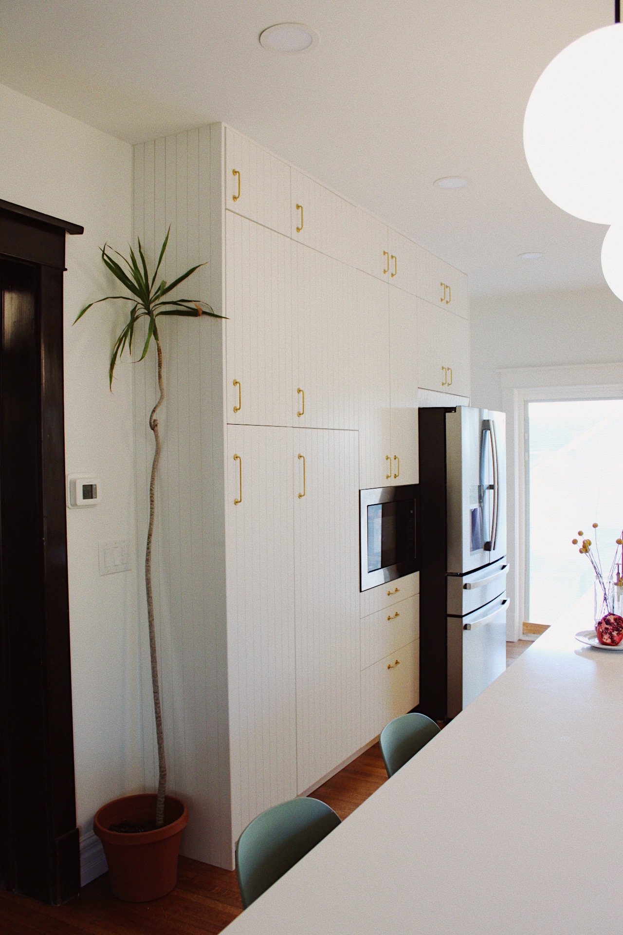
The White tile with Black grout they were considering for the full-wall backsplash (what particular White? Cement or Ceramic tile? Was the Black grout too bold?)
What colors and metal tones would look best for their hardware, lighting, and plumbing fixtures and coordinate with their stainless steel appliances (Brass, Black, Nickel, Chrome? A mix?)
I can easily address these kinds of questions on the fly, but I also usually spend time looking for alternatives to client’s selections when they aren’t quite the right undertones, or are colors that don’t make sense with the existing scheme in adjacent rooms or the rest of the house.
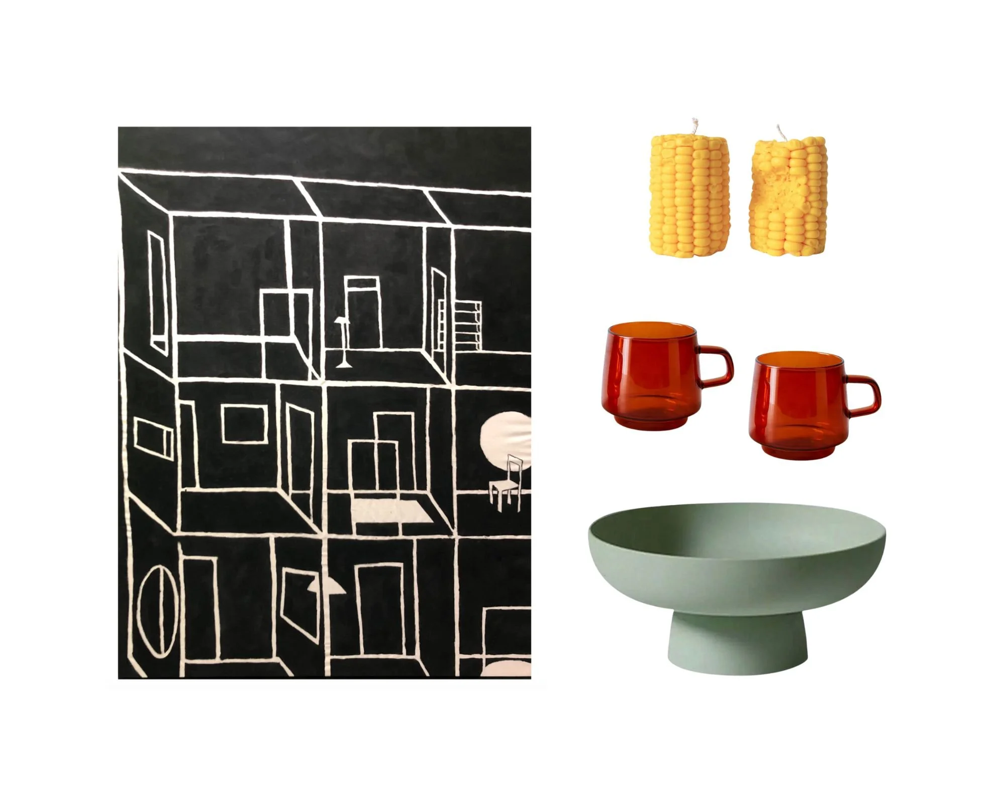
This is where I’ll usually send clients quick photo collages of materials and finishes. While mood boards aren’t a part of the scope of a Gut Check, these quick groupings help illustrate how particular selections we’re considering together will look in a space.
I went back and forth like this with the Peters until their first Gut Check ran out. Kelsey and Jace then hired me to work with them through the remainder of the renovation, seeking my advice and guidance not only on color, but also on design and decor decisions (see A Lively Manner’s Interior Decoration service for more information).
We touched on everything from the kinds of patterns, textures, and forms that would make for a cohesive design across all of the downstairs spaces, to whether or not certain design elements were too trendy or would stand the test of time (tambouring, caning, etc), and the ways they could bridge the kitchen’s design and color palette with the foyer and living room by way of the selections for the new powder room.
And when the kitchen renovation was complete, I visited the Peters’ home to do some styling in the space—helping Kelsey and Jace bring all of the elements together. As part of this process, one of my favorite things to do is ‘shop’ a client’s house for plants, artwork, and decor they already own. This can also include things like treasured keepsakes and ephemera, or even children’s drawings and paintings. Anything that will lend a greater sense of personal narrative, history, and a lived-in quality to what might otherwise feel too new.
It’s also a great way to bring new life to objects that may have lost their luster while living in another area of the house (or gathering dust in storage). And the best part? It’s free! Not only a win for the budget, but also for the planet. Adding a vase or two of fresh (or dried) flowers, or a bowl of fruit is also a nice touch—one my clients get to enjoy for at least a few days, if not weeks, once the session is over.
“ … one of my favorite things to do is ‘shop’ a client’s house for plants, artwork, and decor they already own. It’s a great way to bring new life to objects … And the best part? It’s free! ”


I absolutely love how the Peters’ new kitchen turned out (saving the powder room reveal for another post!). It’s light and bright, with just the right amount of grounding warmth. Classic yet modern, with a wink of cheekiness. And most importantly—polished, yet comfortable and livable.
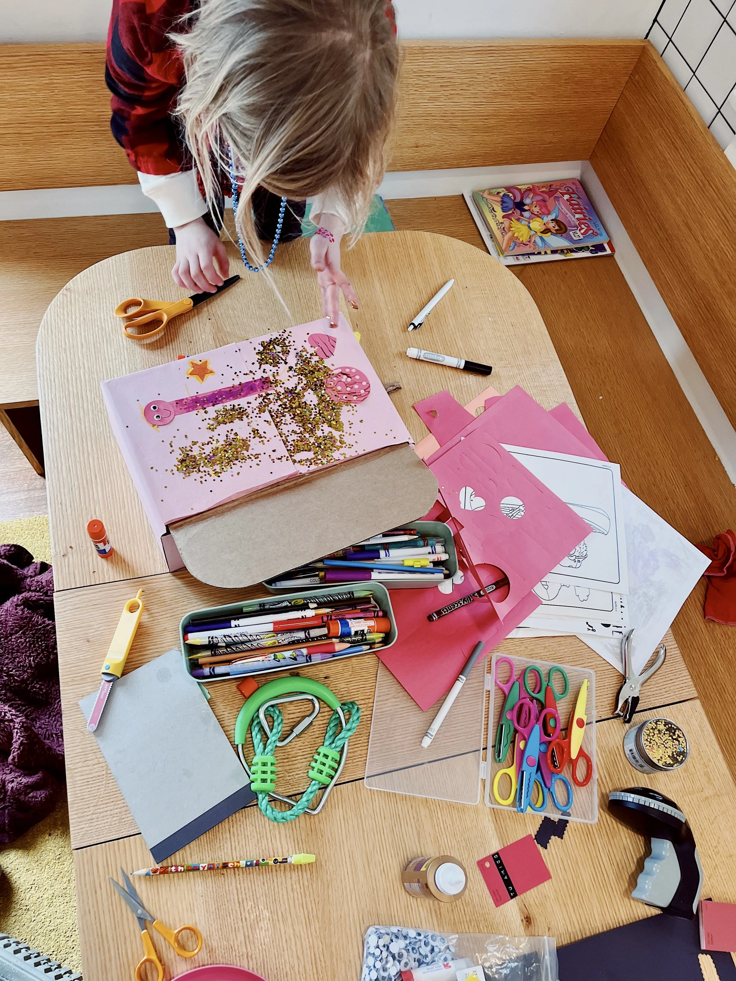
But my feelings about a project’s outcome don’t mean anything unless my clients are also thrilled. Judging by their daughter Lou’s frequent “Folks & Fans” baking sessions in the new space (which you can often catch on Kelsey’s Instagram Stories), craft time in the cozy banquette, dance sessions on top of the window seat, and frequent gatherings with friends and family, it seems safe to say the Peters are enjoying the kitchen every bit as much as I am from afar.
“The Peters’ new kitchen is light and bright, with just the right amount of grounding warmth. Classic yet modern, with a wink of cheekiness.”
Get the Palette
1. Reseda Green (728478), Brown (933D04), Raw Umber (9D6A3A), Dark Goldenrod (A97F2C), White (FFFFFF), Black (000000)
Get the Look
Need a second set of eyes on your project?
Whether your budget is conservative, or the sky’s the limit—I’m here for you! A Lively Manner offers everything from real-time Gut Checks, to Color Scheme Development and Custom Color Palettes, Interior/Exterior Paint + Wallpaper Selection, Interior Decoration, Art Procurement, Styling, and On-Site Shopping Assistance for home owners, renters, landlords, and small businesses.


